Explore this article
Quick answer
What this article explains
Color is often treated as decoration. In plush character design, it is much more than that.
Color is often treated as decoration. In plush character design, it is much more than that.
Color affects how people understand a character before they touch it, read its story, or learn its name. It gives emotional direction. It supports personality. It helps build recognition.
For brands and IP owners, color is one of the fastest ways to shape character identity.
Color creates the first emotional signal
People respond to color quickly.
- Soft colors can feel gentle, safe, warm, or baby-friendly.
- Bright contrast can feel playful, energetic, or bold.
- Muted tones can feel premium, calm, artistic, or collectible.
- Dark colors can feel mysterious, quiet, dramatic, or protective.
- Unexpected color combinations can make a character feel strange, modern, or memorable.
The same shape can feel completely different with a different color system.
This is why color should not be chosen only because it looks nice. It should match the character’s emotional role.
Color helps define audience
A plush product for babies, collectors, brand campaigns, retail shelves, and IP fans may all need different color thinking.
- Baby plush usually needs softness, comfort, and trust.
- Collectible plush may benefit from stronger personality or limited-edition colorways.
- Brand plush needs color consistency with brand identity.
- Retail plush needs visibility and shelf appeal.
- Designer plush may use more unusual palettes to create distinction.
Color helps tell the customer who the product is for.
Too many colors can weaken the character
One common mistake in plush design is using too many colors.
A complex color palette can increase production difficulty, but it can also weaken recognition. When every part of the character competes for attention, the audience may not remember anything clearly.
Strong plush characters often have a disciplined color system.
- One main color.
- One or two supporting colors.
- One memorable accent.
This makes the character easier to recognize and easier to extend into future products.

Color consistency builds brand memory
For character IP, consistency matters.
If the main character color changes too much across products, audiences may lose recognition. If the color system stays consistent, each product strengthens the same memory.
This does not mean every product must be identical. Seasonal editions, collaborations, and limited versions can explore new palettes. But they should still feel connected to the original character world.
Color freedom works best when there is a clear color foundation.
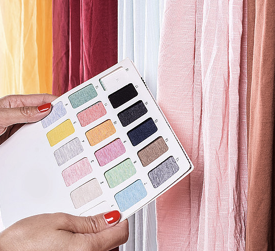
Material changes color perception
In plush, color is not only pigment. It is also texture.
The same color can look different on short plush, long plush, fleece, velvet, or other materials. Pile direction, lighting, and softness can change how the color is perceived.
This is why color decisions should be tested in real fabric whenever possible.
A color that looks perfect on screen may feel too cold, too dull, too bright, or too cheap in material form.
JUSTPLUSH’s perspective
At JUSTPLUSH, we see color as part of character strategy.
Before confirming a palette, we consider the character’s personality, audience, product use, material, brand identity, and future series potential.
A good plush color system does more than look attractive.
It helps the character feel clear, memorable, and emotionally right.